
Have you ever been in a situation where you felt like you had no other choice but to do something, even though you didn’t necessarily want to? If this happened online, then you’re likely to have experienced dark patterns.
These user interface designs were intentionally created to influence users into purchasing or doing tasks they didn’t intend on doing. In this article, we will introduce you to the concept of dark patterns and give some examples so you can better understand how they work and what to look out for when you’re online.
What are dark patterns in UX?
These are one of the more controversial topics in user experience design – deliberately misleading or confusing design elements that trick users into taking actions they might not otherwise choose to do. While some designers argue that dark patterns are used ethically, they are typically implemented to take advantage of customers, often for commercial gain.
Some common examples of dark patterns include things like pre-checking boxes on forms so that users accidentally sign up for something they don’t want or when companies sneakily add items to your basket during checkout. Essentially, any time a design element is used in a way that is intended to mislead or manipulate users, it can be considered a dark pattern.
While dark patterns can be found in all mediums, they are much more common in website and application design. This is likely because digital products are often designed with the goal of maximizing some sort of metric, such as clicks, page views and sales. These goals generally can conflict with the user’s best interests, leading designers to employ dark patterns as a way to achieve their desired results.
How do dark patterns trick users?
Dark patterns implement psychological tactics that lure them into making certain purchasing decisions. These tactics can be subtle and hard to spot, but they are often effective in using persuasion, confusion, or manipulation. There are many dark patterns, but these are some of the most common.
Auto-subscription traps
These are a type of dark pattern that is commonly used by subscription-based services, such as streaming platforms or online dating sites. They require users to enter their payment information before accessing the service. Once the payment information is entered, the user automatically signs up for a trial period or subscription without their knowledge or consent.
Forced continuity
Forced continuity is another type of dark pattern often used by subscription-based services. This method automatically enrols users in a recurring subscription after completing a free trial. This means that even if users don’t want to continue using the service after the free trial ends, they will still be charged unless they take action to cancel their subscription.
Baiting
This is when a company uses a free trial or a low-cost introductory offer to lure users into signing up for a more expensive service. It is typically a promotional tactic that brings users in for cheap or free services, but they aim to retain customers at a higher price for consecutive months. They also inferentially make membership cancellation difficult so users stay signed up for the service.
Bait-and-switch
The bait-and-switch involves promising one thing but then delivering something else entirely. This can be quite deceptive, for example, a website might promise a free product trial but then require credit card information, then charge the user the full price of the product instead of just receiving a free trial as promised.
Hidden costs
This is when a company hides the true cost of a product or service until after the user has already committed to purchasing. It can be especially common when a buyer gets to the end of checkout and realises that shipping fees may be excessive and not being informed of this before item selection.
Pressure tactics
This is when companies use high-pressure sales tactics to get users to commit to purchasing a product or service before they have time to think about it. This usually includes tactics that revolve around false urgencies, like offering discounts for a limited time or showing a countdown timer to pressure the user into buying.
Some examples of dark patterns
Dark patterns are almost everywhere, with varying degrees of malicious internet, whether you’ve noticed it or not, you’re likely to have experienced these during your time online. In particular, when jumping on new websites, you’re probably bombarded by cookie permissions and approvals.
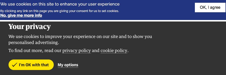
Most websites nowadays that ask for cookie permissions make it difficult to opt-out, which lures users to accept out of complacency. In the example, notice there isn’t any option to decline or opt out. You can only agree or examine more options, it’s almost not worth it for someone that wants access to some quick information and is relatively time-consuming.
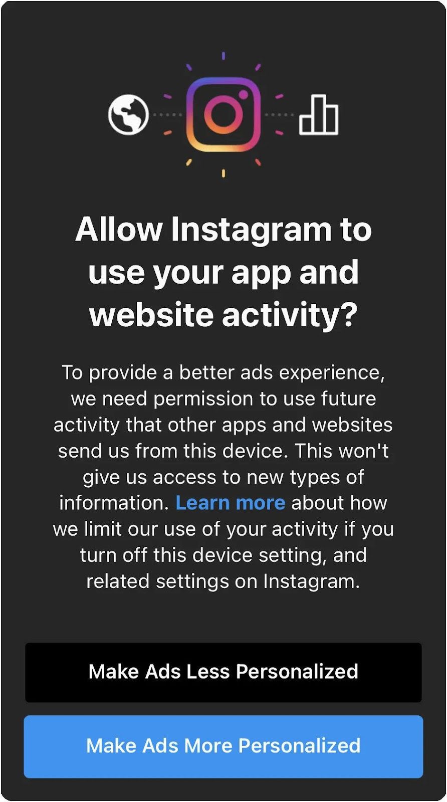
If you’re an Instagram user, you’ve probably seen certain pop-ups asking if you want the application to use your browsing activity. Notice the pop-ups avoid using words like privacy, targeting or tracking. Also, you can see how their opt-in button is bright blue while the other is black.
These are textbook tactics used to influence users to accept tracking permissions to serve their business better. Most users, in fact, don’t want to be tracked and value privacy, but seeing the words “makes ads less personalised” or “makes ads more personalised” may take users away from the awareness that they’re actually opting for data tracking as opposed to only a change in user experience.
Takeaways
Ultimately many of these tactics do work and are still implemented by companies, but they do backfire. Particularly when companies sell poor products and use these tactics to deceive customers. Hopefully, this article has provided some insight so you know what to look for next time you purchase a subscription or product online.
Photo by Tirza van Dijk on Unsplash