 Samuel Shepherd
Web design is a lot like a pond pump.
You might not think about it when you’re staring at the surface, but your pond – or your web page – wouldn’t function without it.
Since the launch of the World Wide Web almost 30 years ago, web design has come a long way.
With the huge variety of devices available now to access the internet, web design has to be more flexible than ever before to adapt to the range of different properties that may be held by any given device.
Things like screen size or pixel size can make the same page look very different between different devices.
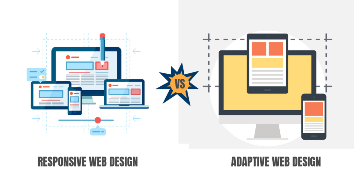
There are two main ways to tackle this problem – adaptive and responsive web design.
I’ll just skip to the end here and tell you responsive web design is better for business, but let’s dive in and take a look at what both of these are all about.
Adaptations? What Adaptations?
There’s a lot to take into consideration when you’re trying to view the same content from two different screens. Imagine a big 12.5-inch laptop screen compared to a little 5-inch phone screen.
If the page has the same layout on the phone as it does on the laptop, then it’ll look cluttered and the text will be so small, it’ll be unreadable.

Things like the page layout, the positioning of text and pictures, height and width, and text size have to be taken into consideration when designing a web page to suit any device.
There’s more to take into account than just appearance though – some devices have touchscreens, and there is a myriad of accessibility adaptations that could affect an individual’s interpretation of the page.
Take a reading text-aloud function, for example – if your headings are pictures of text instead of actual text, this won’t quite work the same way as it should.
In short, the optimised web page design for any given laptop screen will not be the same as the best version of the webpage for a mobile or tablet screen, and what’s best for one mobile phone might not even be ideal for a different mobile.
This is where responsive web design and adaptive web design come into play – they both offer strategies for a developer to make web pages accessible for other devices, though they approach the problem in different ways.
Adaptive Web Design

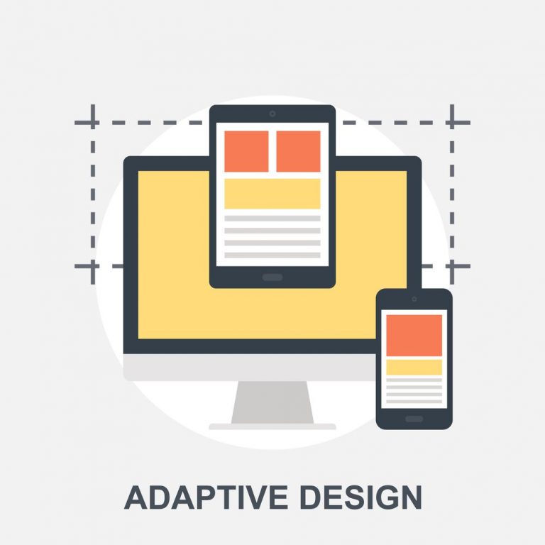
The key feature of adaptive web design is that it offers multiple versions of the same page, depending on the device you’re viewing from.
You can spot adaptive web pages out in the wild by the little “m” in the url, often directly after the “www.”, as in “www.m.facebook”.
Usually down the bottom of the page too, they’ll have little buttons for “desktop site” and “mobile site”, because although they’ll have automatic redirection to the right page for compatible devices, sometimes that feature doesn’t actually work.
And therein lies the common problem of adaptive web design – how often have you visited a mobile site and found it doesn’t do what you wanted it to?
There may be buttons you can’t find, pictures that won’t load, and the search bar either wants to zoom out to the moon or zoom in to pixels, there is no in-between.
With mobiles now accounting for over half of internet traffic, it’s too important to have functioning mobile web pages for businesses, and a great many adaptive web pages just don’t work.
It’s not the website’s fault though – with adaptive web design, you have to design at least two entirely separate pages, both built to accommodate as many devices as possible in a world where no two mobiles will function in exactly the same way.
Short of making a webpage for every specific device, there’s not much else to do to fix this in the realm of adaptive web design.
These are the limitations of adaptive page design.
But do we have to just put up with broken links and 404 pages?
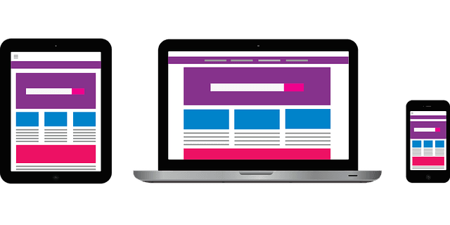
Responsive Web Design
No, you don’t have to put up with pages that don’t look or work right.
Responsive web design differs from adaptive web design in that it offers one page for all devices, but uses a fluid design and CSS media tags to change the appearance of the webpage according to the device that is viewing it.
“Content is like water. You put water into a cup, it becomes the cup.” said mobile designer and developer Josh Clark in his presentation 7 Deadly Moile Mythbs.
It means that content is adaptable, and will fit the form of whatever container it’s in.
It’s like the water in my metaphorical pond; it adapts to the shape of the pond and fits around the river stones and the fish, even as they swim through it.
So how does responsive web design work anyway? In the magical world of coding, there are a lot of “if x then y” statements.
Mostly, these look at the maximum and minimum width of the screen, and pixel density.
Instead of having to design entirely new web pages for every device, it’s as simple as putting a few more lines of code in your existing webpage to say that if the viewing screen is between 600 and 300 pixels wide, then the media should display larger, and the layout should be optimised for a small screen.
The good thing about this technique is that you can be as broad or as specific as you like when designing your page.
It’s even possible to make tiny adjustments, increasing the text size in increments as screen sizes decrease.
Conclusion
Web design is crucial when you’re running a business.
People in the world today expect to find everything they need online, so if you don’t have a website your business won’t do very well.
That said, a bad website is as bad as no website.
The more visually appealing your website is, the more likely it is that potential customers will become real customers when they stick around.
The best webpage should be accessible to everyone on any device, no matter what.
That’s why responsive web design is better for business – because it can respond to the needs of any device, instead of being stagnant.
Like the water in a pond has to move to keep it healthy and oxygenated, the fluid of content has to reshape and adjust as the world changes around it.
When the next new device is released, responsive web design will be ready to adapt to it, while adaptive web design will be left behind by the sheer amount of time it takes to build yet another new webpage up from scratch.
So, all in all, you choose adaptive or responsive web design?
Thank you for reading!